
Designed the Punch options trading app from the ground up, unifying charts, option chain, orders, positions, P&L, and analysis tools into one fluid, single-screen layout.
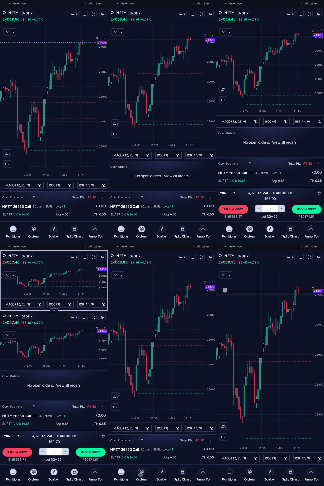
Punch had to be built from nothing. In the early months, the team ran a focused discovery around a single question: how do you fit a professional trading terminal onto a 6-inch screen? I joined on the design side, shaping the UI, the interaction model, and the system that would hold it together.
"YOU CAN'T PUT FOUR SCREENS ON A SIX-INCH SCREEN."
~ a trader, in one of our early research interviews
Our answer was a principle we called Single Screen Trading: make dense, professional-grade information feel simple everything visual, glanceable, and one tap away, never more than a screen from the chart.
.gif)
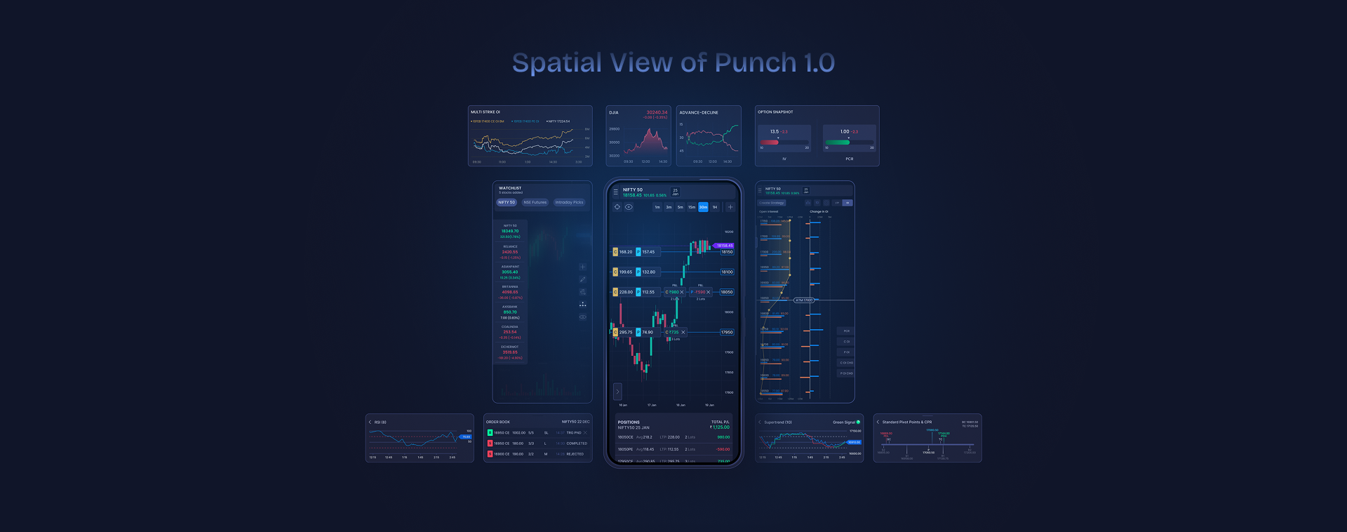
Punch 1.0 Screen
Match each trader's mental model, not force one flow on everyone.
Surface the information that matters to most traders first.
Fit dense, diverse data into limited screen real estate.
Make each piece of information accessible at the right step
Keep the live chart in view at all times.
Solve for unique and rare, high-stakes trading events.
We ran the first leg as a structured three-phase process. Discovery alone was three weeks of trader interviews, sessions with subject-matter experts, competitor teardowns, and mapping both the everyday and the rare trader journeys before a single screen was designed.
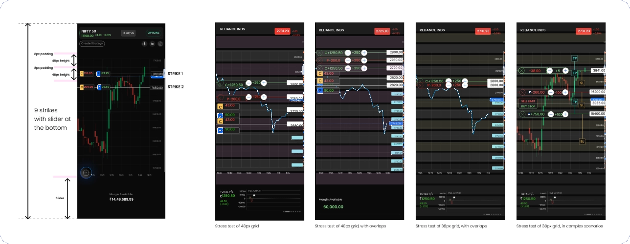
We began by streamlining all the activities undertaken to place a trade. We arrived at the elements and quantities traders would need to analyse, make an entry decision, place the trade, track the trade and review after exiting the trade.
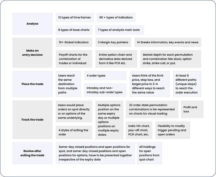
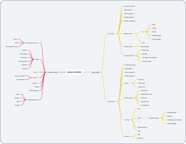
This phase was about exploring the types and styles of trading we needed to design for, identifying edge cases, and translating those into system-level implications. Much of our early ideation involved working through live strategy demos with traders, mapping their needs against app constraints, and stress testing concepts for flexibility and edge-case handling.
The 48-px grid became the backbone of our single-screen trading concept. It allowed users to place trades directly on the chart without losing sight of candle movement or rapid price shifts, something critical for intraday and options traders.
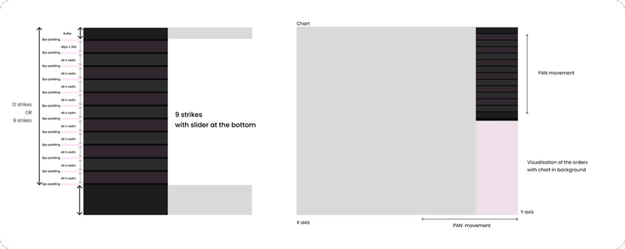
Contextual information like analysis tools, funds, and order details was placed where it naturally fit in the trader's journey: scrip and technical tools at the top, funds and trade-related data at the bottom, and the chart taking center stage. The chart itself could be panned vertically and horizontally to explore past performance.
Each stage of the journey pre-trade, strike selected, preparing the order, in-trade, and post-trade required different information. In traditional apps, traders often jump across screens, apps, or even devices to gather this context. Our goal was to bring all of it into one place, timed and structured around the exact moment they needed it.
Touch interactions were a big part of making the single-screen concept work. They helped tie the layout together without relying on extra screens or menus. Through research and repeated testing with traders, we narrowed the interaction set to gestures people already use every day in their OS and popular apps: tap, double-tap, scroll, slide, pan, pinch, etc.
We used these familiar patterns to access nested layers in the layout and speed up key actions, like opening the option chain, checking available funds, or pulling up the watchlist. Because these gestures were intuitive and already part of users' muscle memory, they fit naturally into different moments of the trade journey.
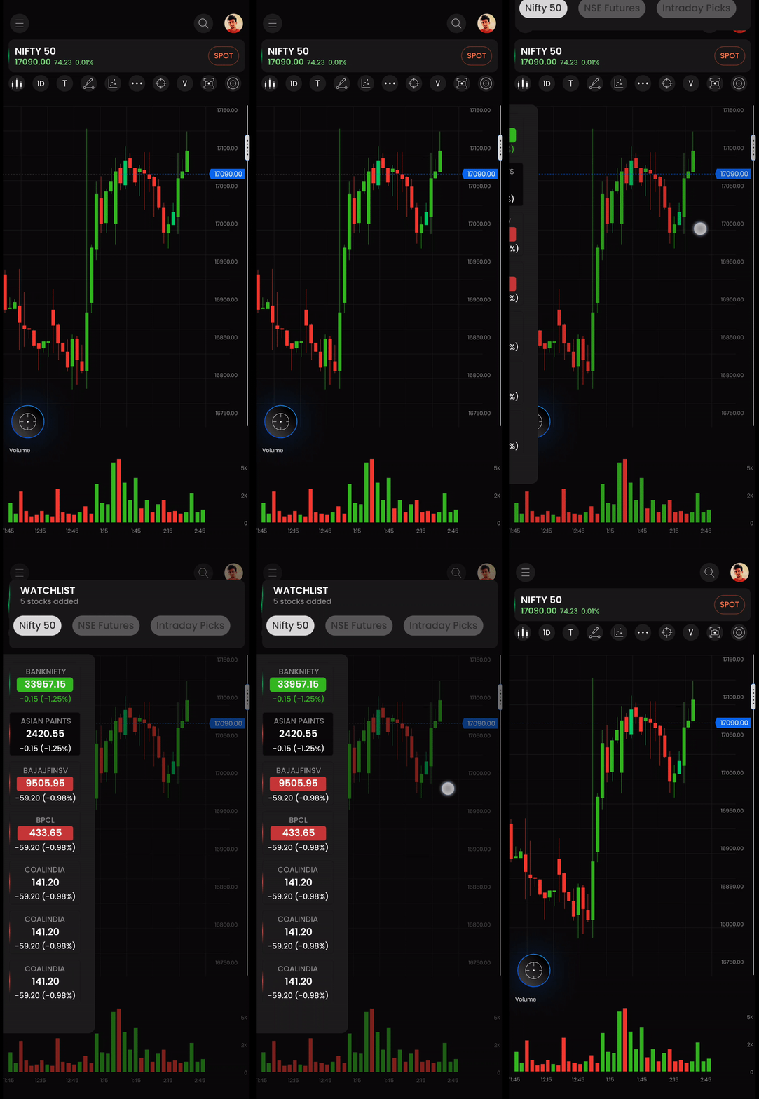

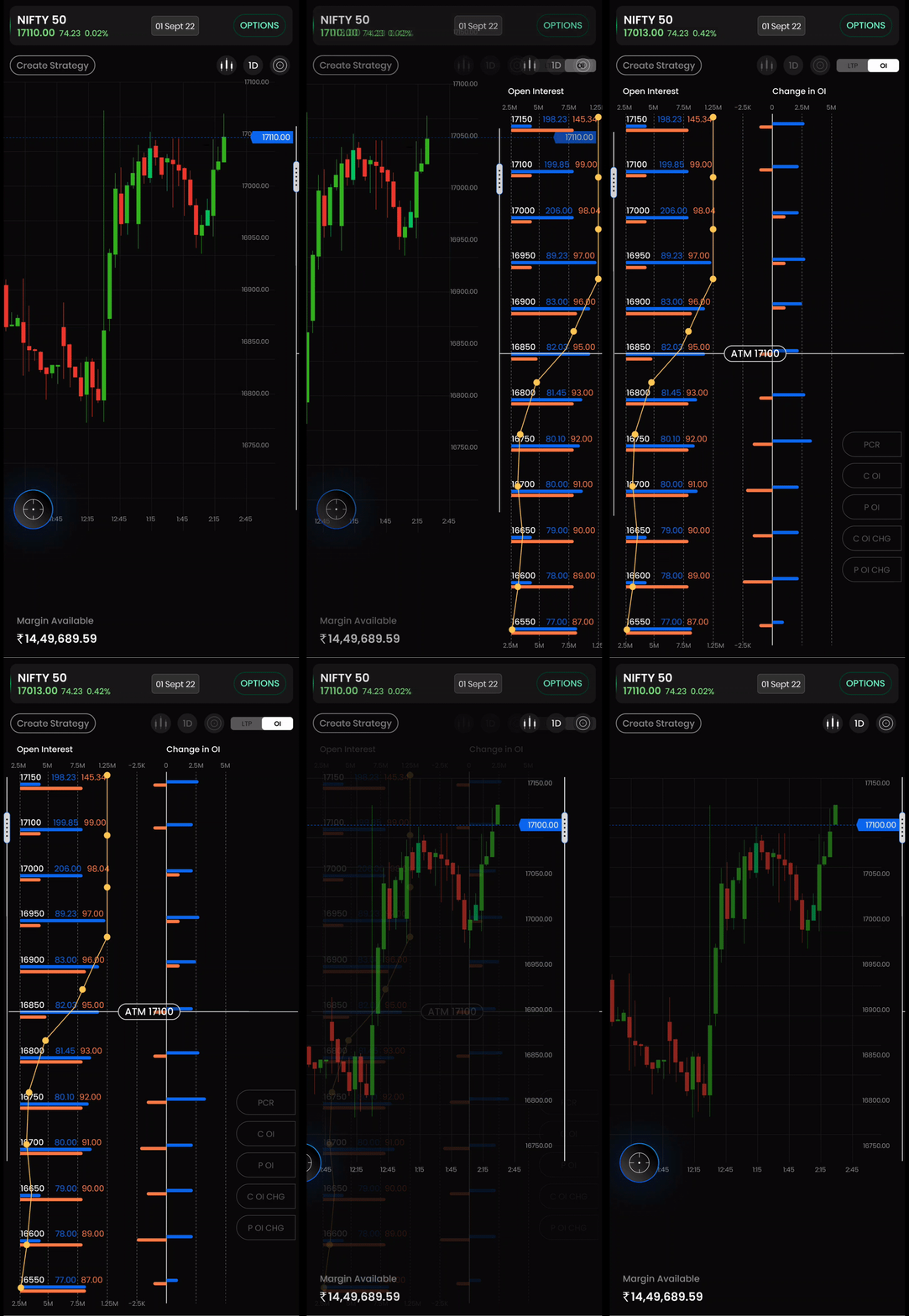
Multiple rounds of testing on the wireframes resulted in numerous revisions and edits to the app's user interface design.
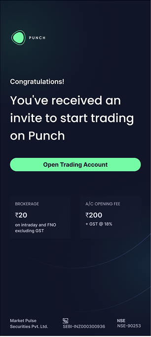
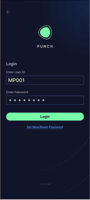
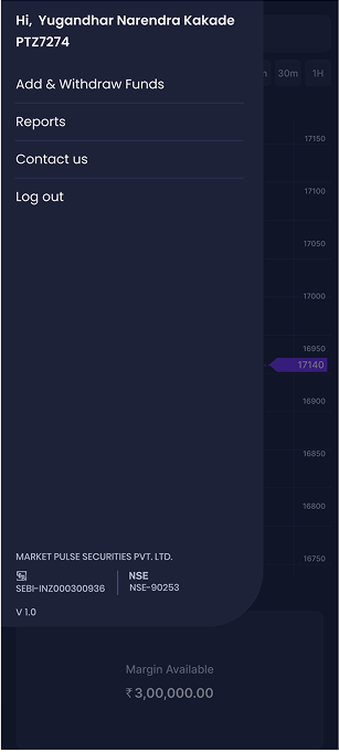
These included changes in icon design, font styles, colour shades, placement and size of components, flows, UX copy, and navigation.
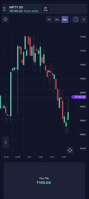
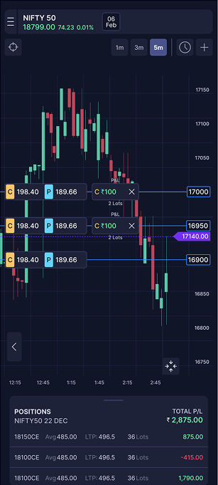
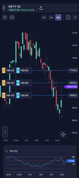
The user research calls also validated the concept of single screen visual trading experience as one that is intuitive, novel and obvious.
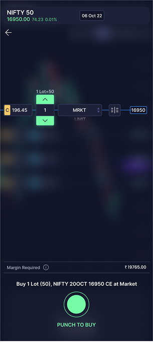
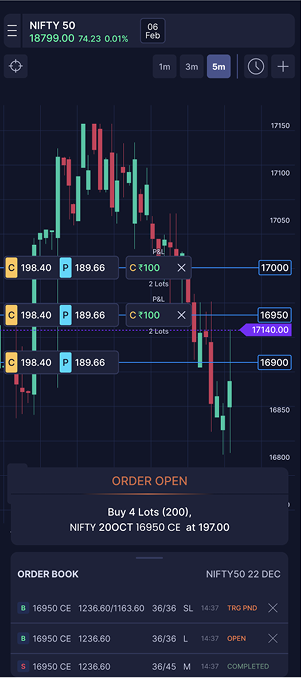
That first build shipped as Punch 1.0 the foundation. But the product didn't stand still. As it grew, the real users turned out to be high-frequency scalpers trading across mobile and desktop, expecting professional speed and control not a beginner-friendly experience.

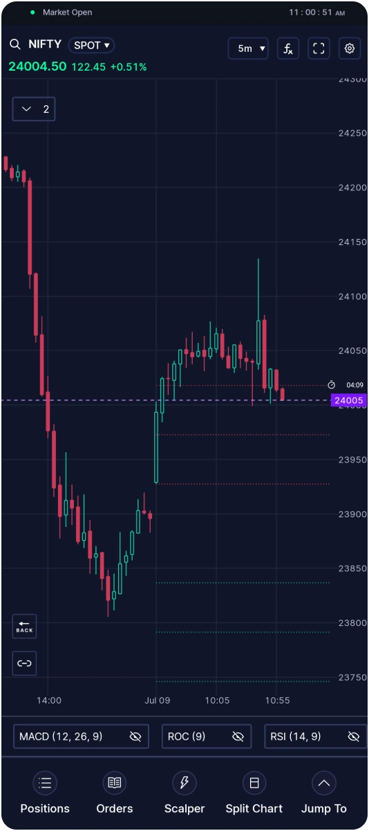
Punch launched as a 0→1 product built to bring charting, order execution, positions, and holdings into a single mobile screen for options traders. Over 4 years, the product evolved through continuous research and iteration the most significant shift being the move from Punch 1.0 to Punch 2.0, driven by a clearer understanding of who was actually using the app.
Punch 1.0 organized the app around four core modules Positions, Order Book, Indicators, and Holdings each living on its own dedicated screen, following conventional trading-app patterns.
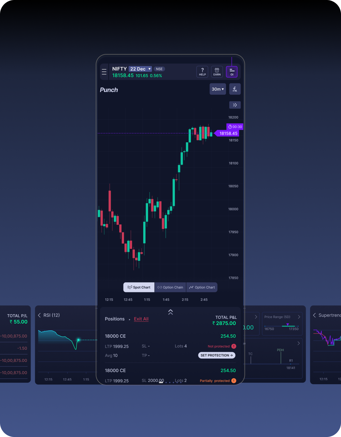
Punch 1.0
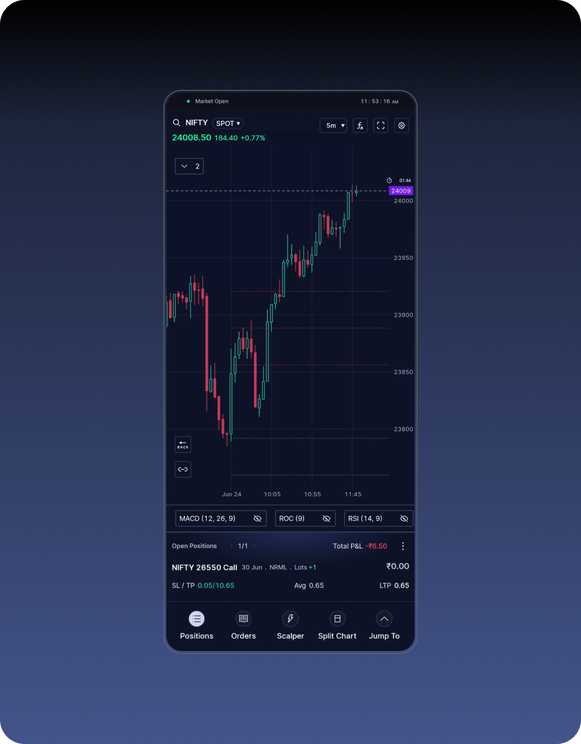
Punch 2.0
As usage data and direct feedback accumulated, a clearer picture of the Punch user emerged: the majority weren't casual or first-time traders. They were seasoned, experienced traders who already understood the market and valued speed and information density over guided simplicity.
For this audience, every full screen dedicated to positions or holdings was a screen pulling attention away from the one thing that mattered most the live chart.
Bottomsheet cards replace dedicated screens.
Positions, order book, and holdings moved from standalone screens into lightweight overlay cards that surface on top of the live chart on demand. The chart stayed in view at all times the single biggest shift in the redesign while experienced traders still reached their data in fewer taps than before.
Order form: Redesign
The order form collapsed from four steps to one tap.
The direction dropdown and the B/S toggle were removed entirely. Quantity moved from a slider-style stepper to a plain minus/value/plus control less novel, but faster and more predictable to operate under time pressure. Direction and execution merged into two buttons sitting side by side: Sell and Punch to Buy. One tap now sets direction and executes, in a single motion and the "Punch" brand language was preserved in the CTA itself rather than sacrificed for clarity.
The shift from 1.0 to 2.0 reflects a core principle in the product's design: decisions should evolve with the audience, not stay anchored to launch-day assumptions. What served a broader, less experienced user base well in v1 screen-by-screen structure, a playful branded CTA became friction for the seasoned trader base Punch actually grew into. Redesigning around overlay density and one-tap execution aligned the product with how its real users trade, without abandoning the brand identity that made Punch distinct in the first place.
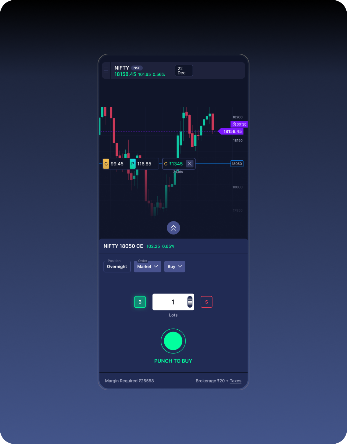
Order form 1.0
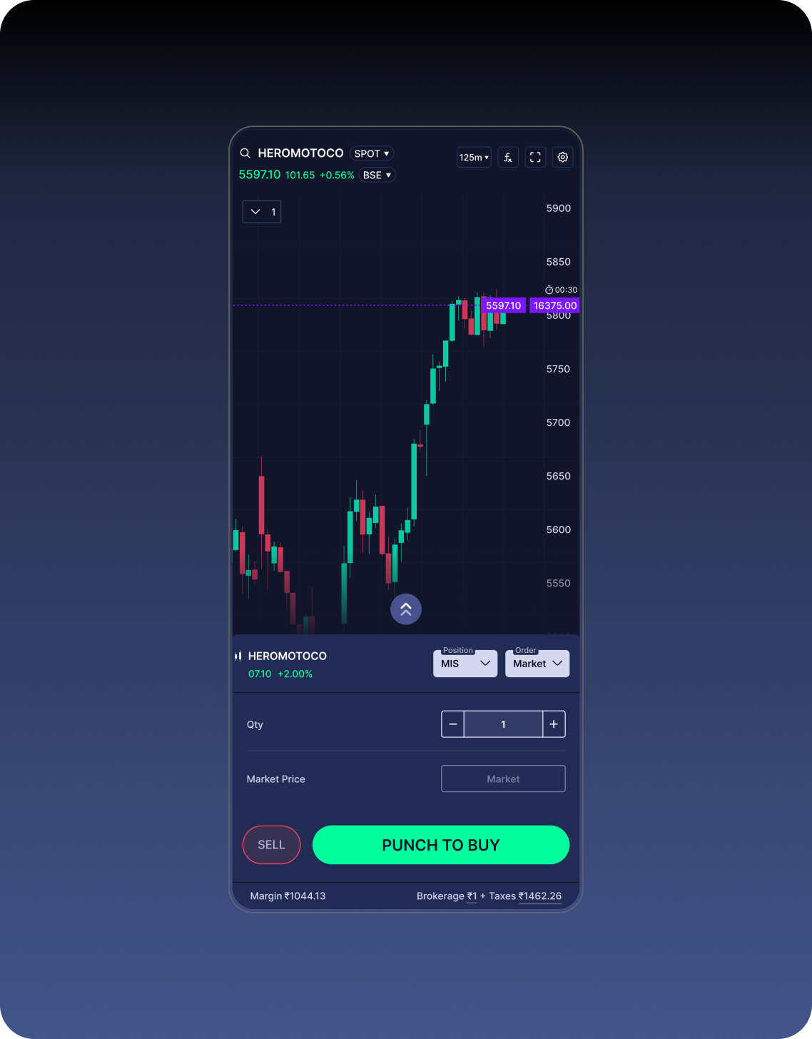
Order form 2.0
Easily manage your SL/TP from your charts. Set both together without extra margin works for scalping, intraday, and swing.
Trade index options in 1-tap with automatic SL and Target placement using presets defined by you. Execute orders in 0.01s for serious scalping on mobile.
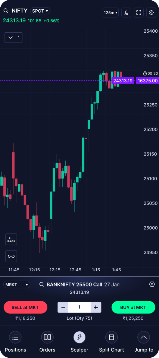
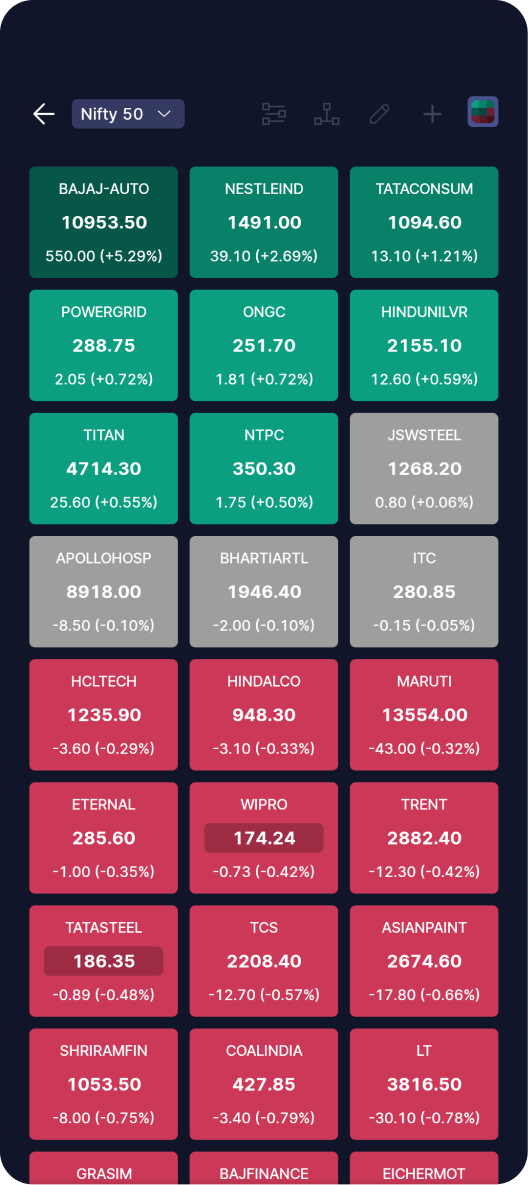
Create unlimited dashboards with full customisations of layouts and widgets
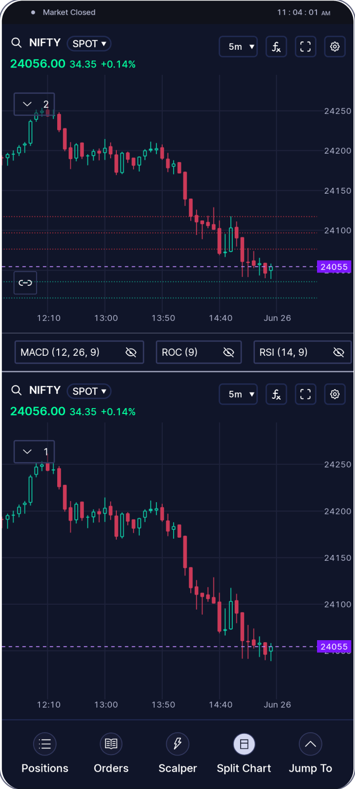
Sophisticated in-house charts that rival TradingView multi-layouts, full indicator customisations, drawing tools. Trade directly from chart with powerful technical analysis.
Designed in Figma. Vibe coded with AI ❤️