

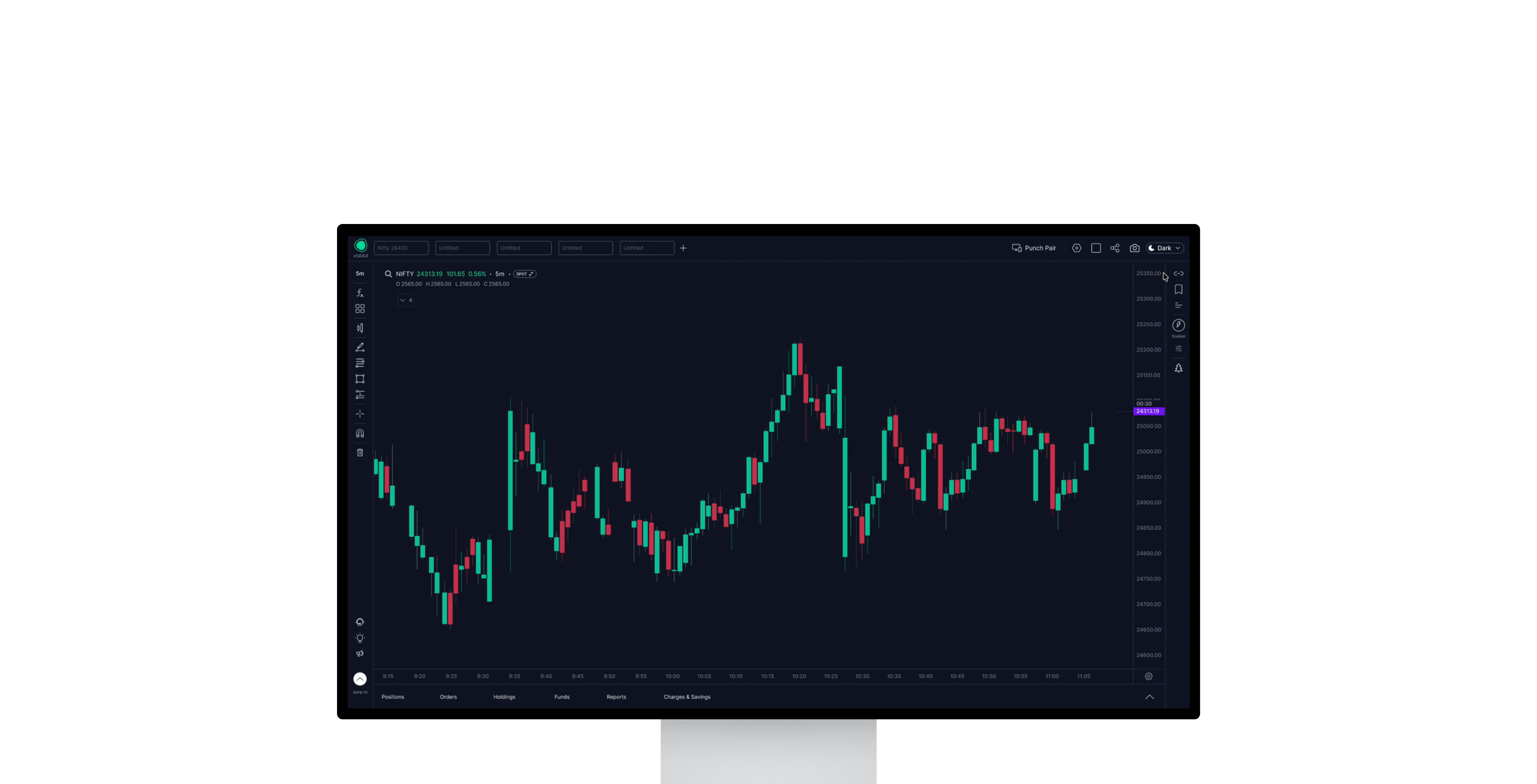
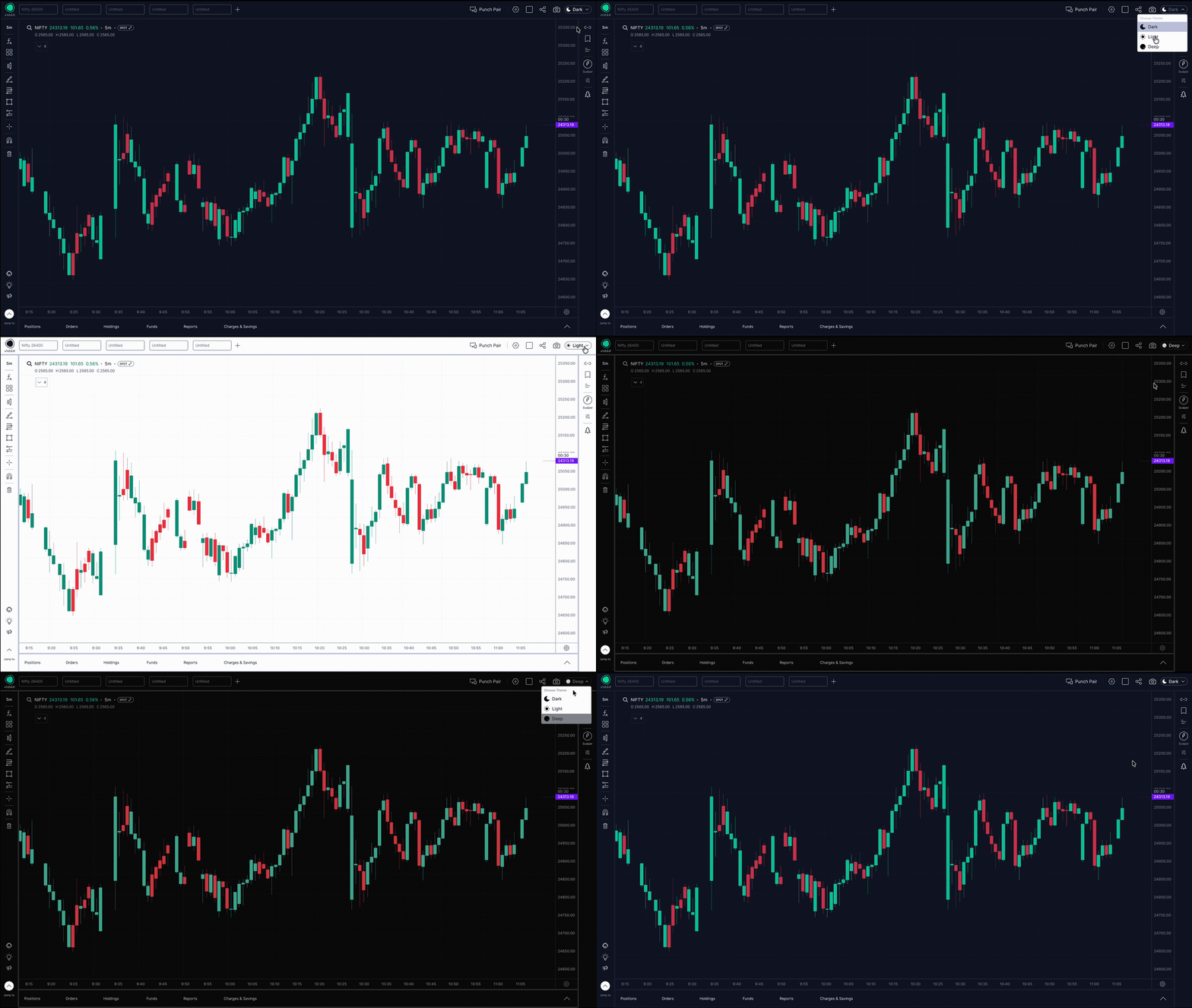
I built a complete design system from scratch, color tokens, typography, light, blue & dark themes, and a full library of scalable components that unified the product team. This is first design system I made from scratch, earlier I had worked on design system which were already in place.
Created reusable, domain-specific UI components for trading workflows, enabling faster feature delivery, greater consistency, and reduced design and engineering overhead. Defined design standards, documentation, and developer handoff practices that ensured strong design-development alignment and supported rapid product evolution from MVP to 10M+ downloads.
Fostered scalable UI practices by advocating for system thinking, reusable patterns, and consistency across the product, enabling teams to build faster without compromising user experience.
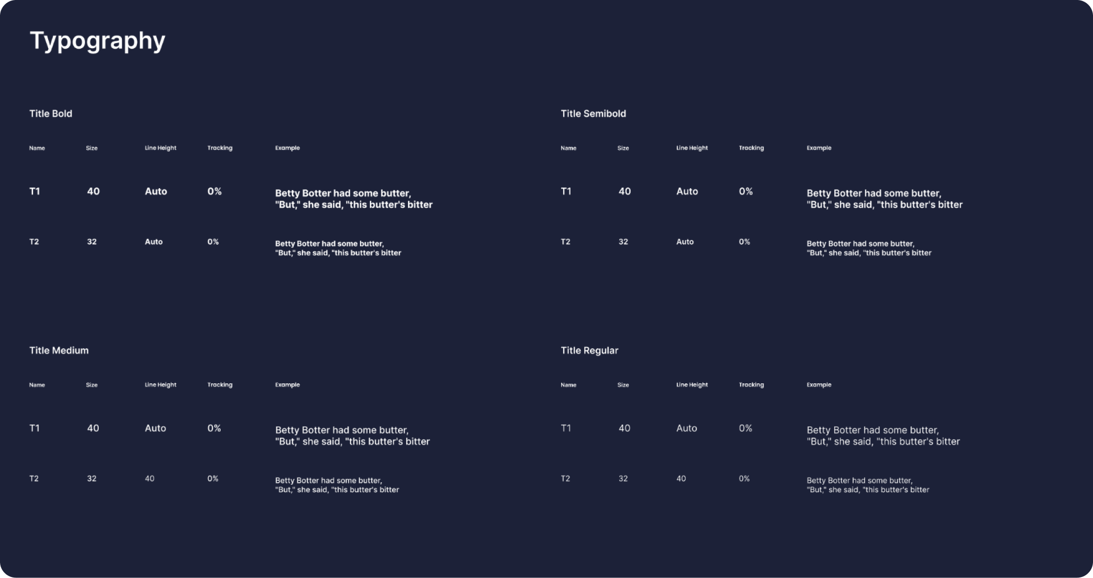
Defined the type styles for the product, named and reused rather than picked per screen. Each style has a set size, line height and tracking, and works across Light, Blue and Dark.
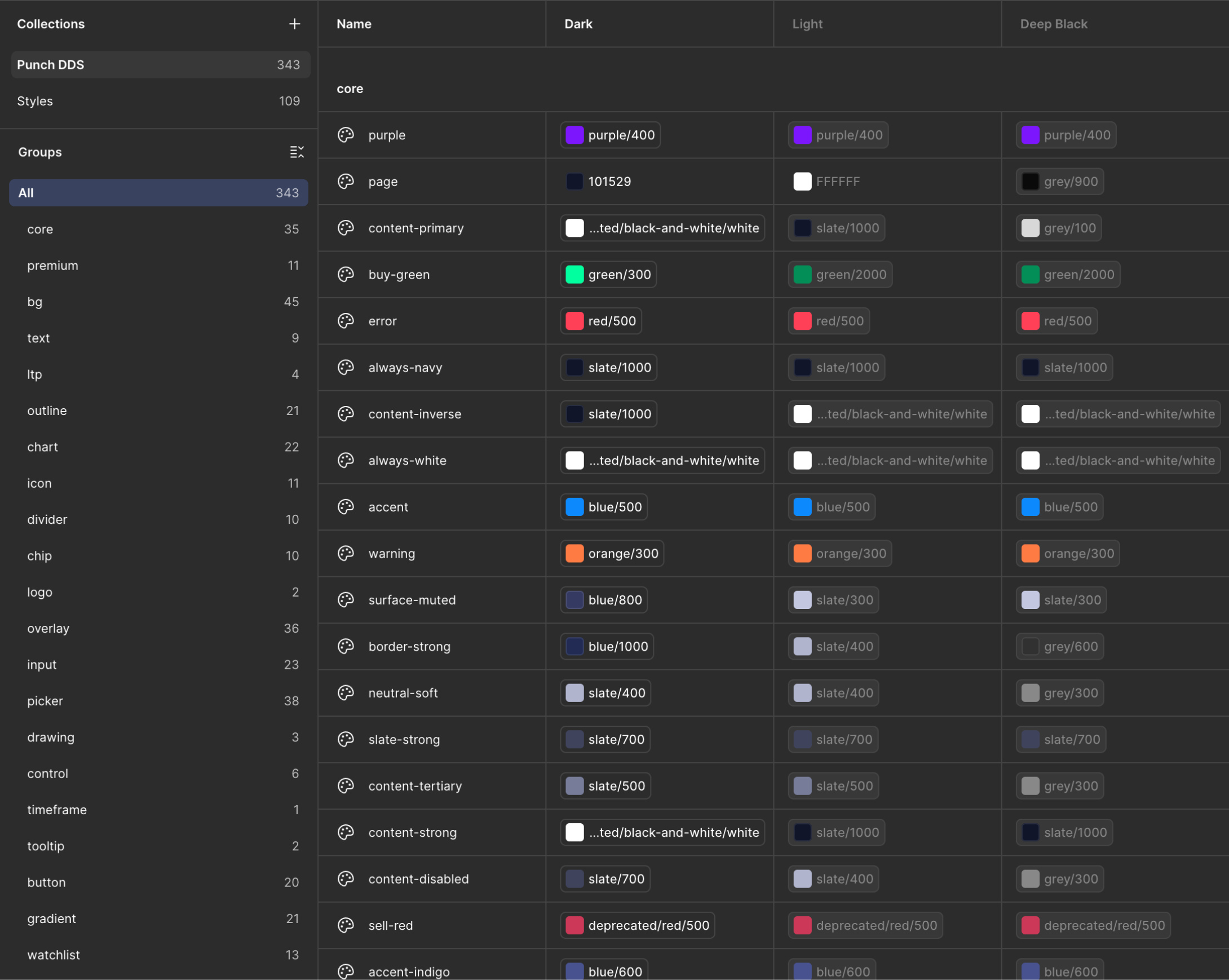
Defined a full token-based color system with three modes: Light for clean interfaces, Blue for branded moments, and Dark for focused environments (so many users asked for Dark theme). Every color is a token, no hardcoded hex values.
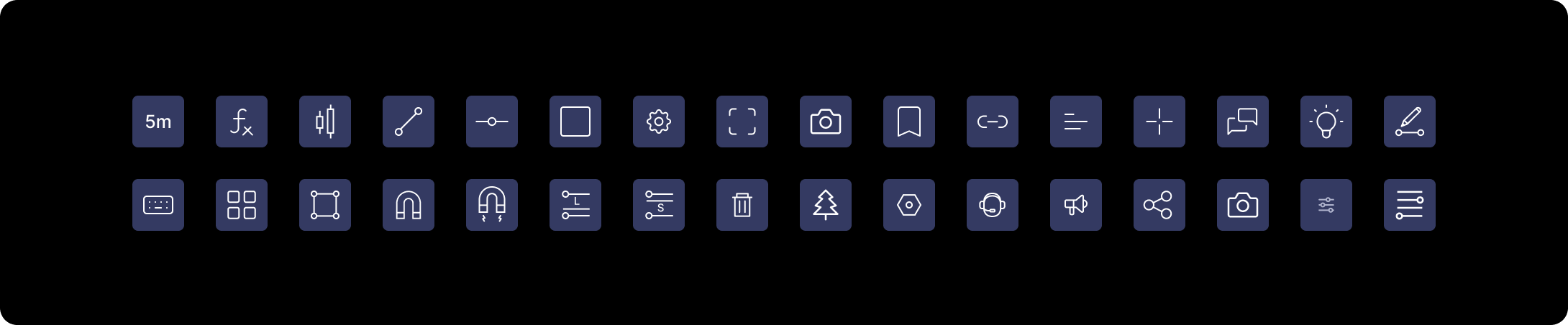
Designed icon library tailored to trading workflows: order actions, chart tools, indicators, alerts, and settings. Every icon follows the same grid, stroke, and corner rules for visual consistency, ships as reusable components, and inherits color from tokens so it works across Light, Blue, and Dark modes.
I created a full library of scalable components: buttons, inputs, cards, modals, navigation, tabs, badges, and more. All built to adapt across themes automatically.
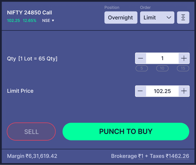
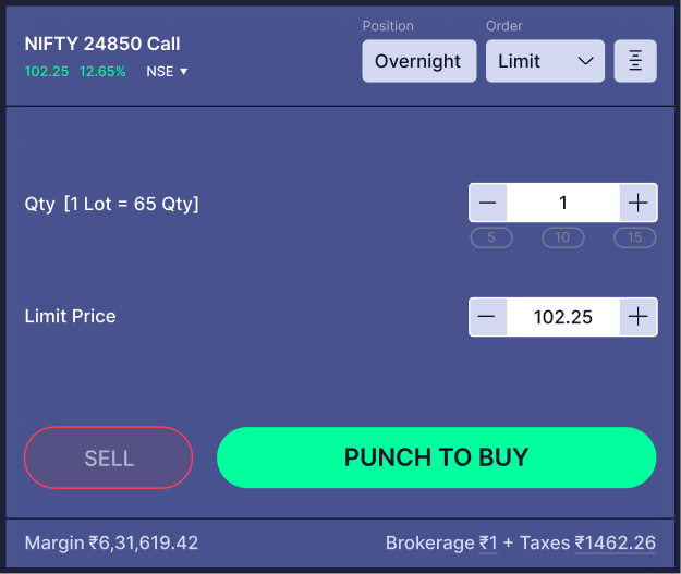
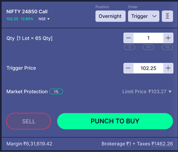
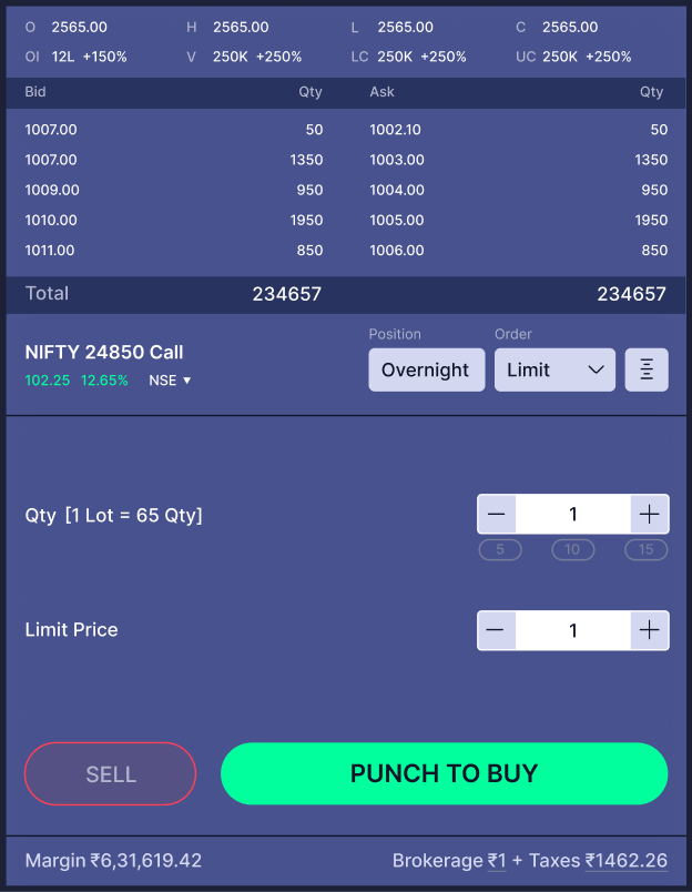
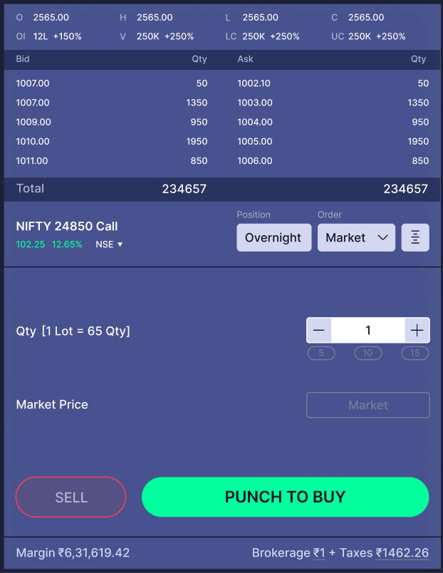
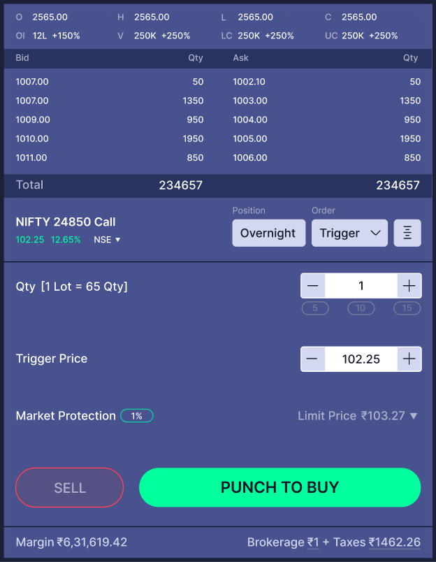
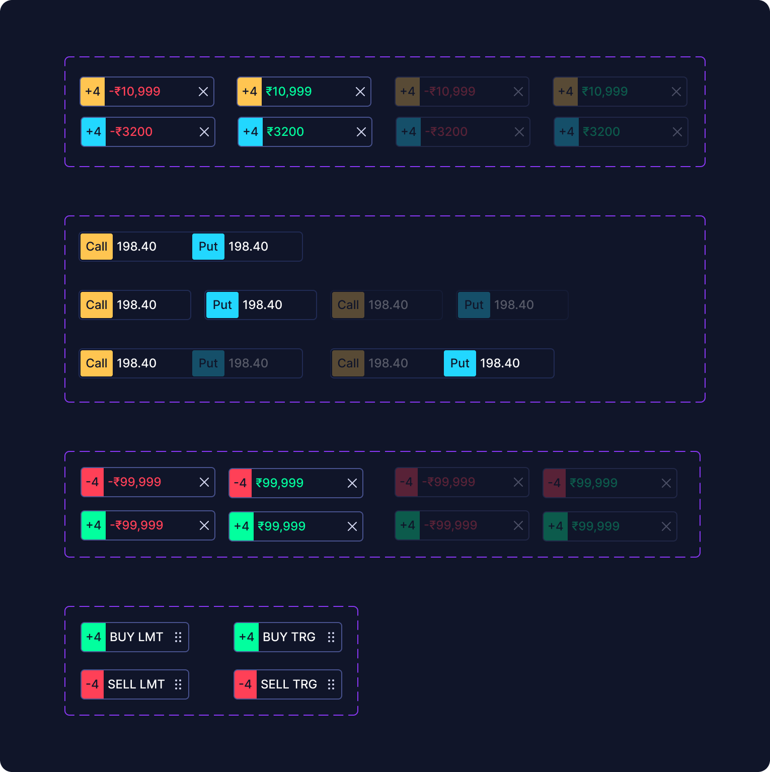
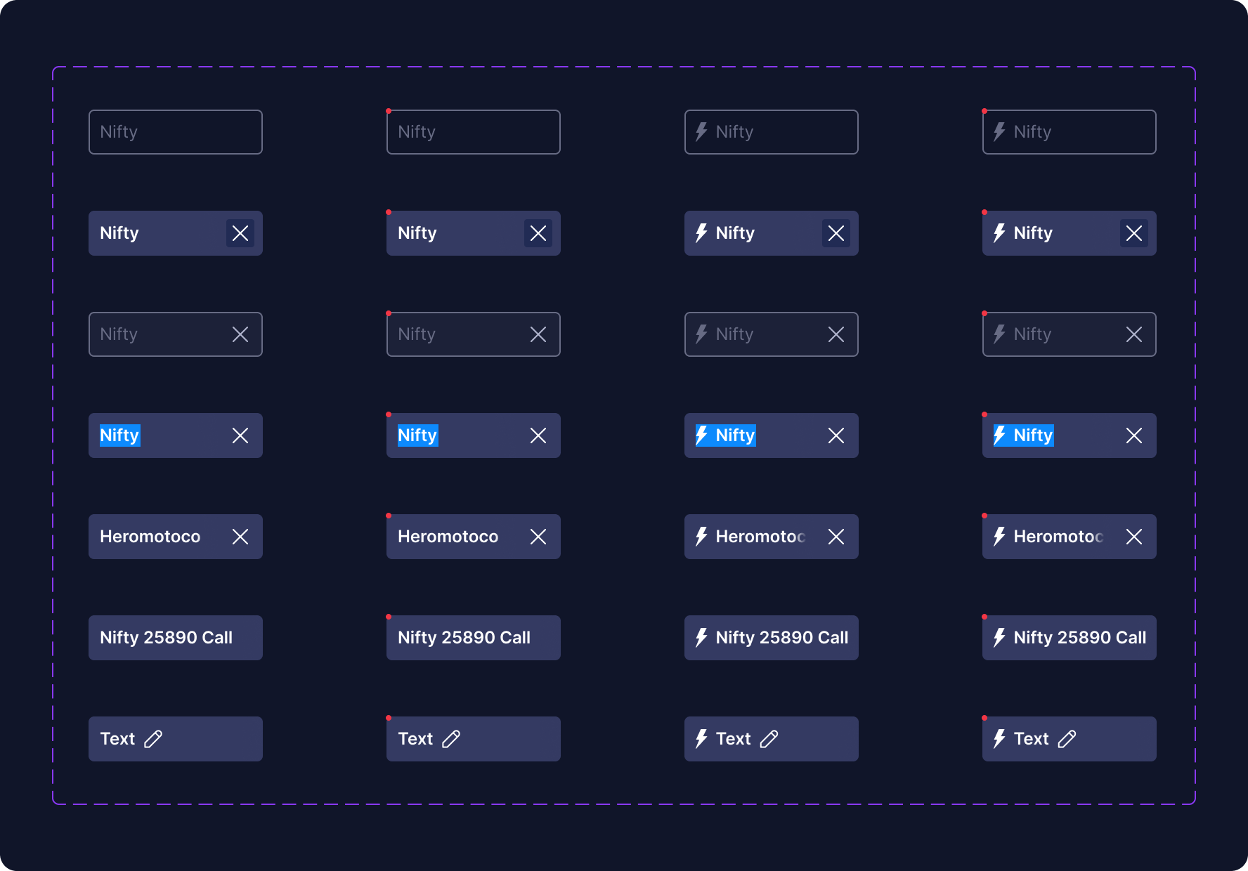
Rebuilt the components in code and documented them in Storybook, with a live example for every variant and interactive state.
In code, Figma's Status variant became real CSS states for hover, focus-visible and disabled. Icons are passed in as props.
The repo has a contributing guide and a changelog. Both render inside Storybook from the actual files, so the docs stay in sync.
Rules for adding a component:
New screens were built from components that already existed, and anything added to the library worked across all three themes without extra design work.
Designed in Figma. Vibe coded with AI ❤️